Table of Contents
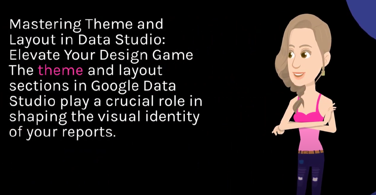
Mastering Theme and Layout in Data Studio: Elevate Your Design Game 🎨📏
The theme and layout sections in Google Looker Studio play a crucial role in shaping the visual identity of your reports. Unleash the full potential of these features to create stunning and cohesive data visualizations. Follow this comprehensive guide to navigate the theme and layout sections with finesse.
Step 1: Open Your Data Studio Report
Visit Google Looker Studio and open the report you want to enhance with a captivating theme and layout.
Step 2: Navigate to the Theme Section
On the right-hand side of the screen, locate the “Theme and Layout” tab. Click on it to access a range of customization options.
Step 3: Choose a Theme
Select a predefined theme that aligns with the aesthetic you envision for your report. Google Looker Studio offers a variety of themes, each with its unique color palette and typography.
Step 4: Customize Colors and Typography
Refine your chosen theme by adjusting colors and typography to match your brand guidelines or personal preferences. This ensures a consistent and professional look throughout your report.
Step 5: Explore Layout Options
Move to the layout section to experiment with different arrangements. Choose from single-column layouts for simplicity or multi-column layouts for a more dynamic presentation.
Step 6: Adjust Margins and Padding
Fine-tune the spacing between elements by adjusting margins and padding. This level of detail contributes to the overall readability and aesthetic appeal of your report.
Step 7: Apply to All Pages
Optimize your workflow by applying your chosen theme and layout to all pages in your report. This maintains a cohesive design across the entire document.
Use Case Example:
Imagine you’re preparing a quarterly sales report for a client. By using a theme that aligns with the client’s brand colors and optimizing the layout for clarity, you create a visually engaging and impactful report.
Pro Tips for Advanced Design:
1. Custom Themes:
Learn how to create custom themes to perfectly match your brand identity. Create Custom Themes.
2. Grids and Guides:
Explore the use of grids and guides to align elements precisely. Grids and Guides Tutorial.
3. Mobile-Friendly Design:
Ensure your reports are optimized for mobile viewing by adjusting layout elements accordingly. Mobile Optimization Guide.
Hashtags: #DataDesign #ThemeAndLayout #DataStudioTips
Explore More at Cratos.ai 🚀
Frequently Asked Questions
Lorem ipsum dolor sit amet, consectetur adipiscing elit. Ut elit tellus, luctus nec ullamcorper mattis, pulvinar dapibus leo.